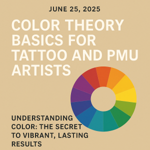
Paper is a useful place to explore colour relationships before discussing procedure-specific pigment choices with your trainer. Keep the purpose of the exercise clear: a paper palette can help you compare a design, but it cannot predict how a tattoo or permanent makeup result will heal.
Change one thing at a time
Choose a simple design and make three copies at the same size. Use a limited palette for the first, change one colour for the second and adjust the light-dark contrast for the third. Keep the drawing and viewing conditions consistent so you can describe what the change does.
Write down where your eye goes first, which shapes remain easy to distinguish and which areas merge together. Use those observations to explain a design decision rather than relying only on whether a combination is your favourite.
Build a comparison sheet
- Keep the design and scale the same across the examples.
- Name or record the drawing materials used.
- Note the single change made in each version.
- Describe the effect on contrast and the focal point.
- Write one question for your trainer.
Separate design studies from pigment decisions
Do not turn a paper swatch into a mixing recipe for use on a person. Pigment selection, product compatibility and any corrective work require the relevant training and product instructions. A general colour wheel does not establish that a particular product can be mixed with another or that an existing result can be corrected in a particular way.
Likewise, a screen image or a quick description of a skin undertone is not a guarantee of a healed colour. Discuss the limits of the exercise instead of promising that a chosen shade will heal exactly as it appears on paper.
Make your feedback request specific
Show the three versions together and ask about the decision you were testing. For example: which version makes the main shape easiest to read, and why? Record the response and make one revised study. Keep both versions so you can explain the change.
Photograph the studies under consistent lighting and retain the originals. Strong filters or automatic colour changes can make a comparison less useful. Label the sheet as a design exercise rather than a treatment example.
Explore the available Skinart courses and review the curriculum for your chosen subject.