Before choosing a complicated palette, practise making a small design readable. Colour decisions become easier when you separate light and dark, intensity and the relationship between neighbouring colours. Start on paper or in a digital drawing exercise so you can compare alternatives without changing several variables at once.
Separate value, hue and saturation
Value describes how light or dark a colour appears. Hue is the colour family, such as red or blue. Saturation describes its intensity. Two different hues can have similar values, so changing colour alone may not make adjacent parts of a design easy to distinguish.
View a copy of your drawing in greyscale to check the light-and-dark structure. If the main shape disappears, revise that structure before adding more colours. Keep the colour version too: the comparison is an exercise, not a rule that every design must look the same in both views.
Tattoo shading practice: build a value scale on paper
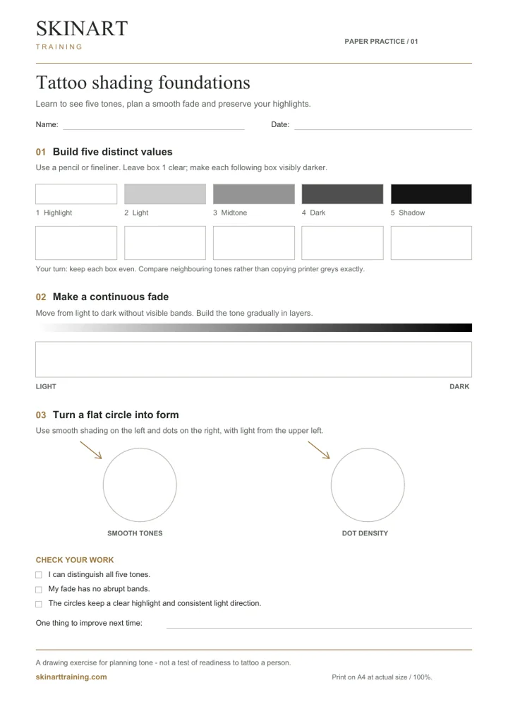
Before adding colour, practise separating the light and dark parts of a design. This original Skinart worksheet gives you three drawing exercises: five distinct tones, a continuous fade and two studies of a simple form. Use a pencil or fineliner; no tattoo equipment is needed for the paper exercise.
Download the free shading worksheet (A4 PDF)
One page, 7 KB. Print at actual size or 100%. No sign-up is required.
Preview the printable worksheet
1. Make five tones you can tell apart
Leave the first box as clear paper. Make the last box your darkest tone, then build three distinct steps between them. Work towards an even finish within each box. Compare neighbouring boxes: if two look almost the same, adjust one before moving on. The printed greys are a guide; printer settings and paper can change their appearance.
2. Turn the steps into a smooth fade
Use the blank strip to move gradually from light to dark. Build the tone in light layers rather than trying to finish the darkest end immediately. Look for abrupt bands, repeated stripes or isolated dark patches. Keep the light end clear enough to distinguish it from the middle.
3. Give a circle form
Keep the light source at the upper left. Shade one circle with smooth tones and the other with dots, leaving a clear highlight in both. For the dotted version, compare sparse and closely spaced marks. The two drawings should explore the same light-and-dark structure through different marks.
Review one thing before repeating
- Two boxes merge: separate those tones before adding more detail.
- The fade shows bands: soften the transition between adjacent areas.
- The circle still looks flat: check the highlight, darkest area and light direction together.
Date the sheet and write one change to try next. Compare attempts made with the same materials. Bring that comparison to your tutor when discussing your practical study. For a separate exercise in endpoints, curves and shapes, use the free line-control practice sheet.
Limit the first palette
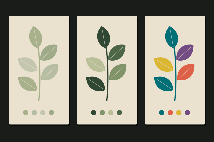
Draw the same small motif three times. Use a limited palette for the first version, a more muted version for the second, and a stronger contrast for the third. Keep the drawing and size unchanged. Compare which version makes the focal point easiest to find and which becomes busy.
Write down your choices rather than relying on memory. A page of named swatches with brief notes is more useful for learning than a folder of attractive references with no explanation of why they work.
Use references as a study tool
Choose one reference and identify its dominant colour, supporting colours and lightest and darkest areas. Describe what draws your eye first. Then create a different drawing that explores the same relationship. This builds an understanding of the choice without copying someone else’s design into your portfolio.
Keep design exercises separate from pigment decisions
A screen or paper swatch is not a promise of how a finished tattoo or PMU result will look. Treat these exercises as a way to learn visual relationships. Product selection and work on skin need the relevant practical training and product guidance; do not turn a colour-wheel exercise into a pigment-mixing recipe.
For PMU study, keep your design observations distinct from decisions about products or corrections. Bring those questions to your trainer with a clear description of what you are trying to understand, rather than choosing a product because its online photograph matches a reference.
Build a useful study page
- Show the original drawing and three palette variations.
- Add one greyscale comparison.
- Identify the intended focal point.
- Explain one successful choice and one change to try next.
A tutor can respond more precisely to this short comparison than to “Does this look good?” Keep the page as part of your progress record and repeat the exercise with a different motif.
Write down why one version works better
Imagine three paper versions of a leaf design: one with similar light values, one with a darker central shape, and one with several equally bright accents. Compare where your eye goes first and whether the outline remains easy to read at a smaller size. A useful note might be, “The darker centre makes the main shape clearer; the extra bright accents compete with it.” Keep this as a design observation. It is not a prediction of healed colour or an instruction to mix products for use on skin.
Continue your study in Canada
For structured study, explore the online tattoo course or online PMU course for learners in Canada. Review the course outline and current options before choosing your training.
Ask the Skinart team about your learning plan if you need help matching a course to the skills you want to practise.